A unique home is not just a collection of trendy furniture. It relies on precise technical choices: color palette, materials, proportions, indoor air quality. Each decision permanently shapes the atmosphere of a living space, far beyond the immediate visual effect.
Formaldehyde and air quality: the decor criterion that catalogs ignore
As of August 6, 2026, the European Union is implementing a new limit on formaldehyde emissions for furniture and wood-based products, through entry 77 of Annex XVII of the REACH regulation. The maximum emission value in a test chamber has been halved compared to the traditional E1 class threshold used by manufacturers.
In practice, old E1 certificates are no longer sufficient as a health argument. Brands must revise certain panels, glues, and finishes to comply with the new threshold. For a home decor project, this changes the game when choosing reconstituted wood furniture, a custom bookshelf, or a kitchen countertop.
Before purchasing, check that the product complies with the current REACH regulations. Compliant furniture directly contributes to indoor air quality, especially in a bedroom or poorly ventilated space. You can explore the home category on Always Unique to discover selected furniture pieces and decor items with this requirement in mind.
Warm neutrals and earthy colors: the palette that replaces all-white
Clinical white minimalism is coming to an end. Several trend analyses for 2025-2026 document a clear shift towards textured warm neutrals: beige, sand, greige, ivory. Neutral grays are gradually giving way to more enveloping earthy tones.
Three families of shades stand out to create a unique atmosphere:
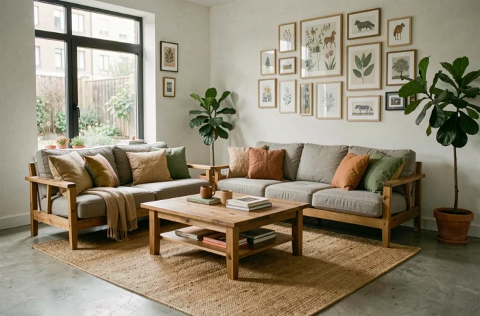
- Deep earthy colors (terracotta, ochre, clay brown) bring warmth without visually saturating a living room or open space.
- Moss greens and sage greens function as plant-based neutrals, particularly suited to spaces oriented towards a garden or terrace.
- Bright off-white (like Cloud Dancer) replaces pure white while maintaining clarity without the clinical effect, especially when paired with raw wood or linen.
Applying a single strong color per room is enough to transform the space. A terracotta wall in an off-white living room creates a focal point without needing to repaint everything. A common mistake is to multiply strong shades in the same room, which quickly produces visual saturation.
Raw materials and textures: adding depth to every room
The trend of warm neutrals only works if accompanied by varied textures. A beige wall with a beige sofa and a beige rug creates a flat effect. Differentiation comes from contrasting materials, not just colors.
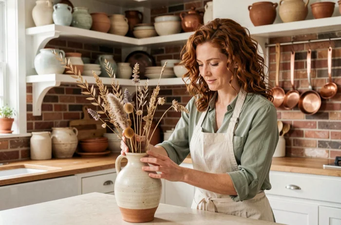
Solid wood (oak, walnut, ash) remains the most versatile base. Paired with crumpled linen for textiles and handcrafted ceramics for decor items, it creates a layering of textures that adds character to an interior without resorting to bright colors.
Mixing finishes without falling into chaos
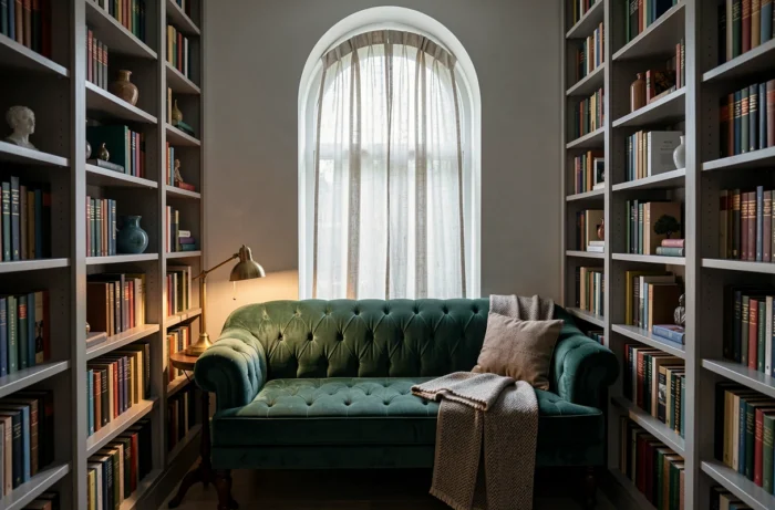
A simple principle helps avoid visual cacophony: limit finishes to three families per room. For example, in a living room, combine matte light wood, satin black metal, and natural fiber textiles. Adding a fourth finish (glossy lacquer, tinted glass) dilutes coherence.
Touch matters as much as appearance. A slightly sanded raw wood table top, a boucle wool cushion, a glazed stoneware vase: these tactile contrasts make a space feel alive, even within a restricted color palette.
Lighting and proportions: two underestimated levers in interior decoration
Light radically changes the perception of colors and materials. A beautiful terracotta under natural light can turn dull brown under cold LED lighting. Testing shades at different times of the day and under the planned artificial lighting avoids costly disappointments.
Multiplying light sources (reading lamp, low pendant above a table, wall sconce) creates areas of varying intensity within the same room. A single ceiling light in the center produces uniform lighting that flattens volumes and cancels out the effect of textures.
Playing with furniture proportions
A piece of furniture that is too small in a large living room disappears. A massive piece in a narrow room suffocates it. The basic rule for balanced arrangement:
- Place the largest piece of furniture first (sofa, sideboard, bed) and organize the rest around it, leaving sufficient circulation passages.
- Vary heights: a very low coffee table paired with a tall bookshelf creates a vertical depth effect that identical-height furniture does not produce.
- Use one or two oversized objects (a mirror, a pendant light, large-format wall art) as a visual anchor rather than scattering several small decorative elements.
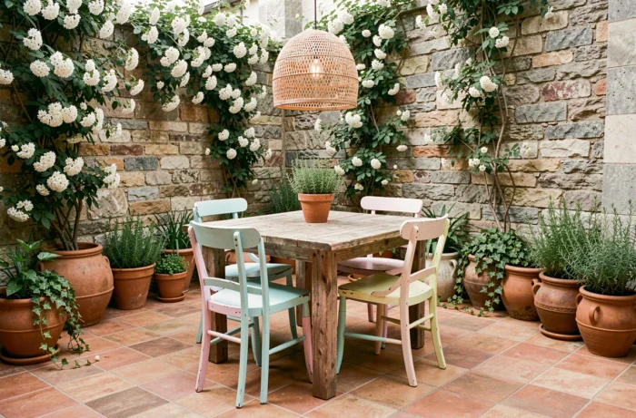
A single large object makes a stronger statement in a space than ten small scattered objects. This approach also reduces accumulation, a frequent source of visual fatigue in overloaded interiors.
Building a unique home relies less on budget than on the coherence of choices. A palette of three shades, materials whose health compliance is verified, thoughtfully zoned lighting, and a few well-proportioned furniture pieces are enough to create a lasting interior, free from disposable fashion effects.